ADVERTISEMENT
We were told to create an advert promoting a product related to what we're going to study. In my case, as I am going to study architecture as well as the rest of the group, we decided to promote a software called IBM (Building Information Modeling).
 |
| 1* |
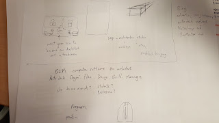
The picture above shows the ideas we had before starting the process of creating an advert.
For creating the advert, we were suggested to use two different Softwares: Photoshop or Picmonkey. At first, we decided to use Picmonkey but it didn't let us edit the image how we wanted to so we used Photoshop instead.
The image above was taken using a Samsung Galaxy S6 edge with professional mode On. ISO: 100, WB: 2800, MP: 16.
Te idea was creating a progression from the drawing, then using the software and finally, the real building.
STEPS.
Step 1: By outlining the section we wanted to change the style.
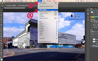
Step 2:For the second part of the building, we had to choose a filter that looked as if we were using IBM, so we chose Stamp and changed the contrast by changing the light/dark to 25 and the Smoothness to 5.
Step 3: For the last part, we used a filter called Neon Glow. Glow size 5, Glow Brightness 15, Glow Colour Blue.
Step 4: We added the logo onto the picture by dragging it to the place we wanted to and then we added the full name of BIM.
Step 5: Finally, we added two shapes (the ones pointed with the red arrows) taken from the website of the software.
The green shapes are taken from:
FINAL RESULT
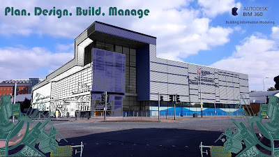
This is the final result of the Advert showing the three stages of building a building from the sketch to real by using IMB.
Comparisons with other adverts.
We looked to some adverts before starting to create ours.
| 2* |
This one is similar to what we wanted to show. However, it doesn´t show the sketch.
During this process, I learnt that an advert tells us lots of things about the product that is being represented so next time I see one, I will observe it carefully and in detail. About the creation of the advert, I had never used Photoshop so this was a new rich experience that will help me to develop new ideas in the future without having any barrier in the process of project creation.
REFLECTION
After having done the advert, then we went to the university library to print it, so we used the colour printers to print out the photo in A4 size using photographic paper but we realised that the colours came out darker than we thought.
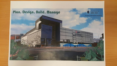
Then, we had to present the advert to the class using this photo. At the end, we got some comments written by our classmates and teachers.
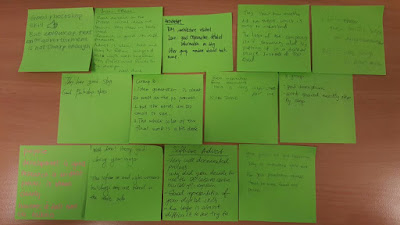
After having reading the comments, We decided to improve our advert by adding three new signs that represent more what the software does.
 |
| 3* |
3* The three signs: http://www.autodesk.co.uk/solutions/building-information-modeling/overview


No comments:
Post a Comment